Click through Images
Recognizing Brokenness in Substance Abuse Counseling
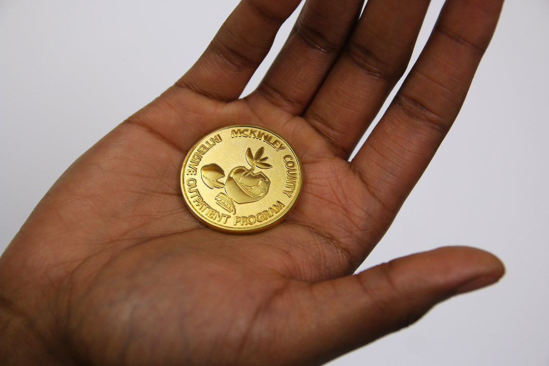
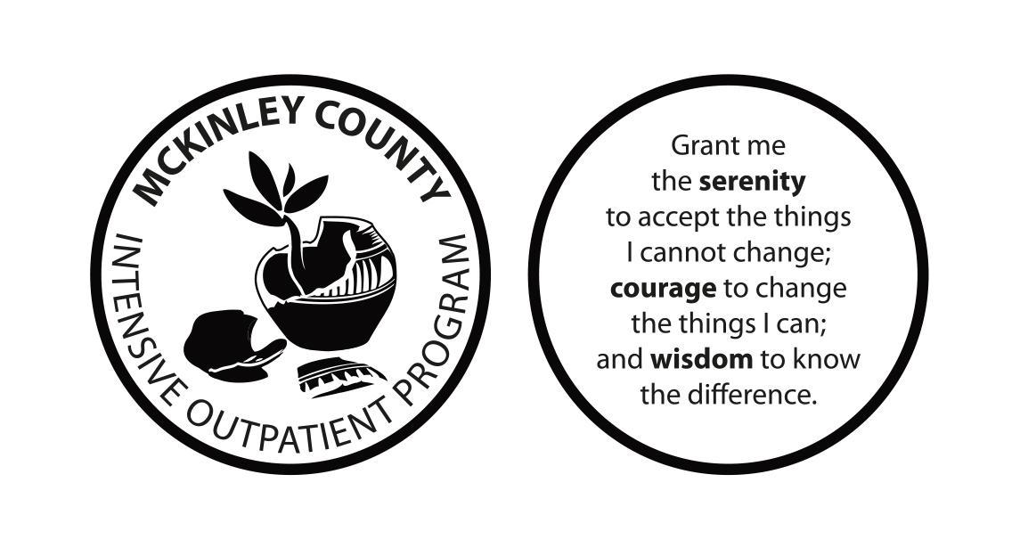
McKinley County Intensive OutPatient Program Identity
The intensive outpatient program works with a majority native population in Gallup NM, counseling clients who suffer from substance abuse.
There’s a certain gritty reality to counseling in substance abuse. Counselors aid and nurture, but they are also interested in what’s real and honest and what REALLY helps their clients progress onward out of debilitating illness. Sugar-coating the truth doesn’t work. We approached this project with a realization that the truth needed to be acknowledged and honored– that this unique group of clientele comes from a very real place of brokenness.
Professionalism needs to be emphasized in the identity of the program. The logo conveys a sense that this isn’t backwoods, slap-together, whatever-type healthcare, but a serious, credentialed, viable and informed group of pros, who deserve respect, who one can count on to get an excellent quality of service. The identity of IOP, had to be simple, clean, polished, and avoid cartoony and rough (see the “Drive in Beauty” Campaign).
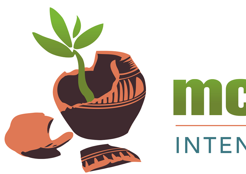
We thought of the Native clay pot as a nod to the culture of Mckinley County and Indian Country, but it also serves another purpose. The pot is damaged– a recognition of the broken life of an addict, the shattering of and disrespect toward traditional values, of the inherent disharmony that comes with substance abuse.
But instead of being discarded after being broken, this pot, this life, is re-purposed. A new seed is planted, and a new life emerges from the brown of the earthen pot, green with vitality and possibility, and a relentless desire to live and overcome the past.
The symbol of the broken pot recognizes that the past can’t be undone, but a seemingly worthless existence suddenly has new hope, in a new direction. Thus the mark comes to represent not only the area, but both truth and future hope.
Like the ceremonial basket, the plant shoot emerges from the center, the sacred place. The cracked opening actually gives it more light, more opportunity to grow and learn and become better. It immediately sprouts four leaves, honoring the number 4 as a sacred number and the four sacred directions. The traditional ways are the foundation in which it takes root. So, there is great spiritual significance to the mark without being overbearing or in-your-face.
Glyph Engine came up with the concept and design and executed the illustration.
Client
McKinley County DWI Program
Category
Concept Design Logo Illustration

