The 100% Campaign
Calendar Illustrations
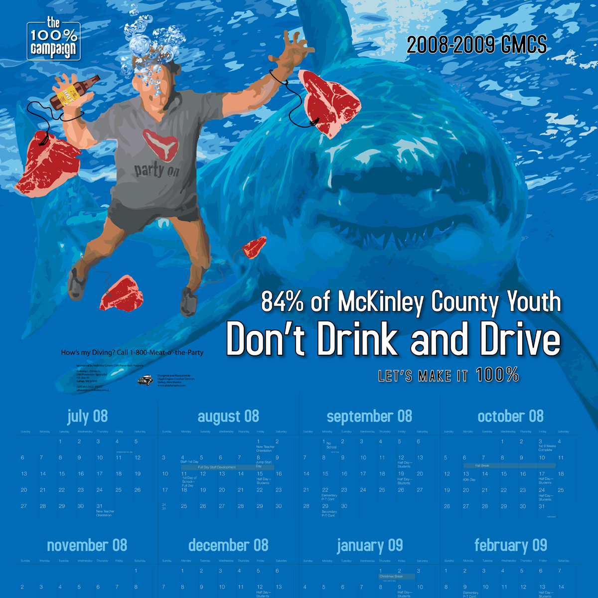
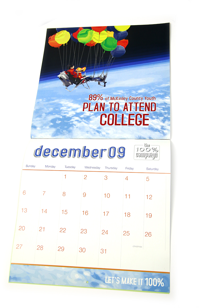
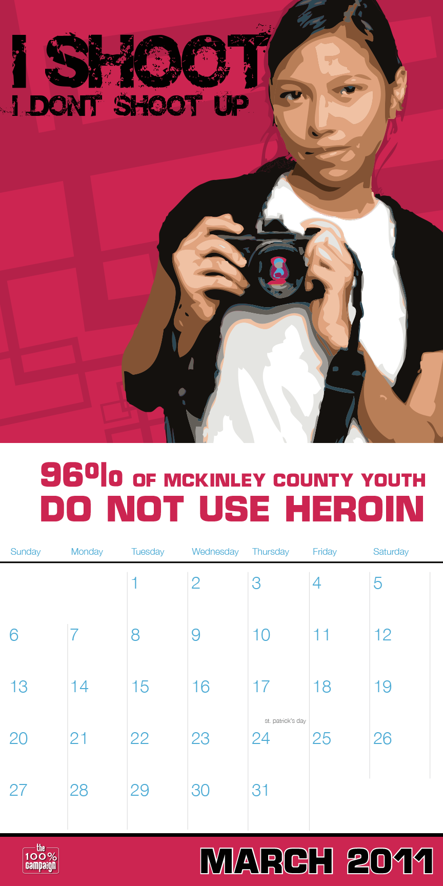
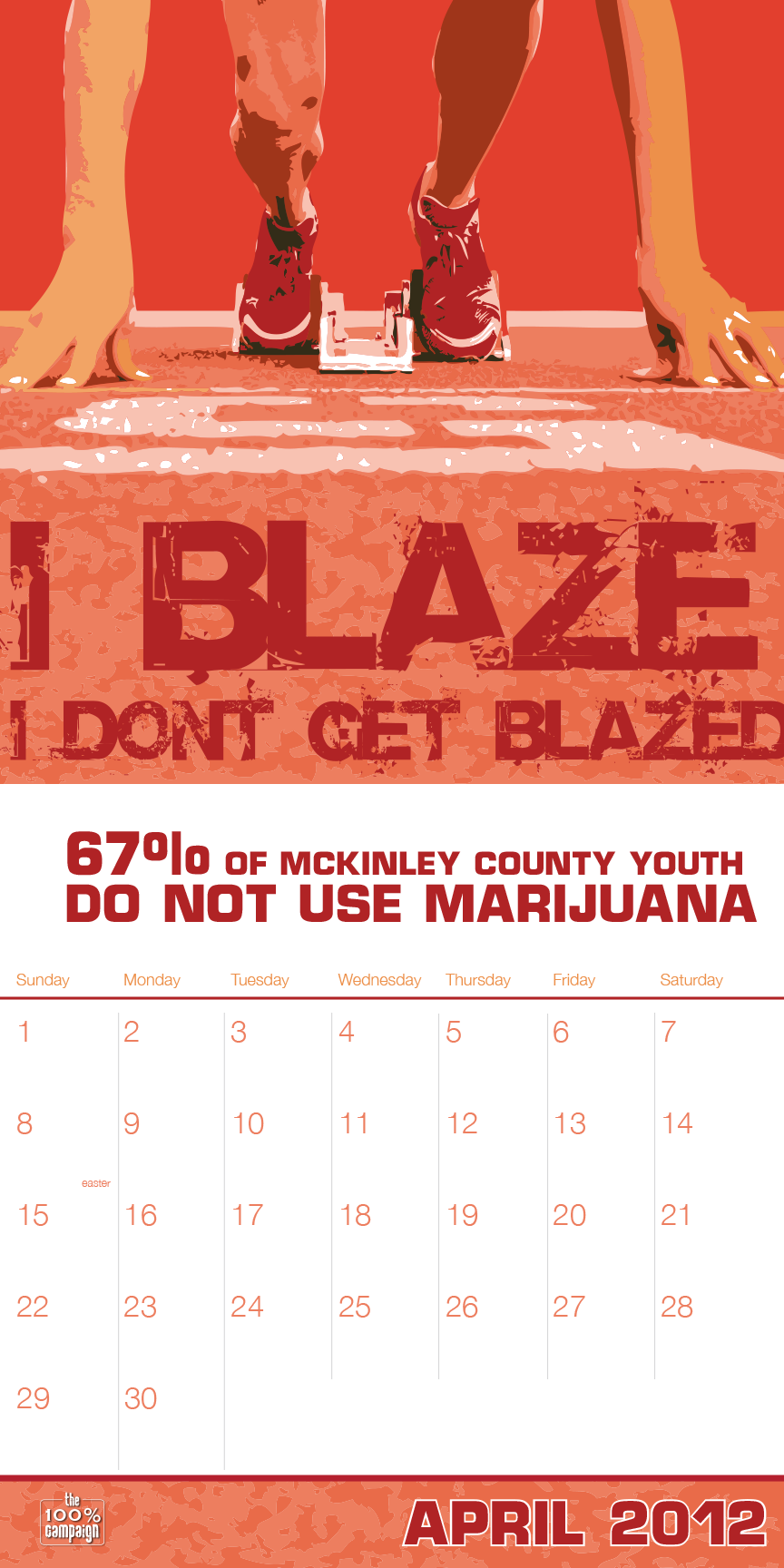
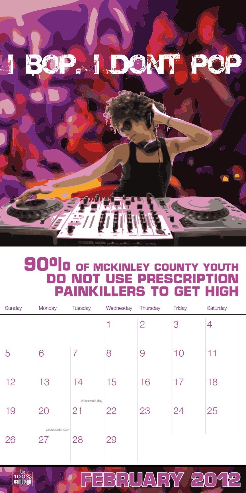
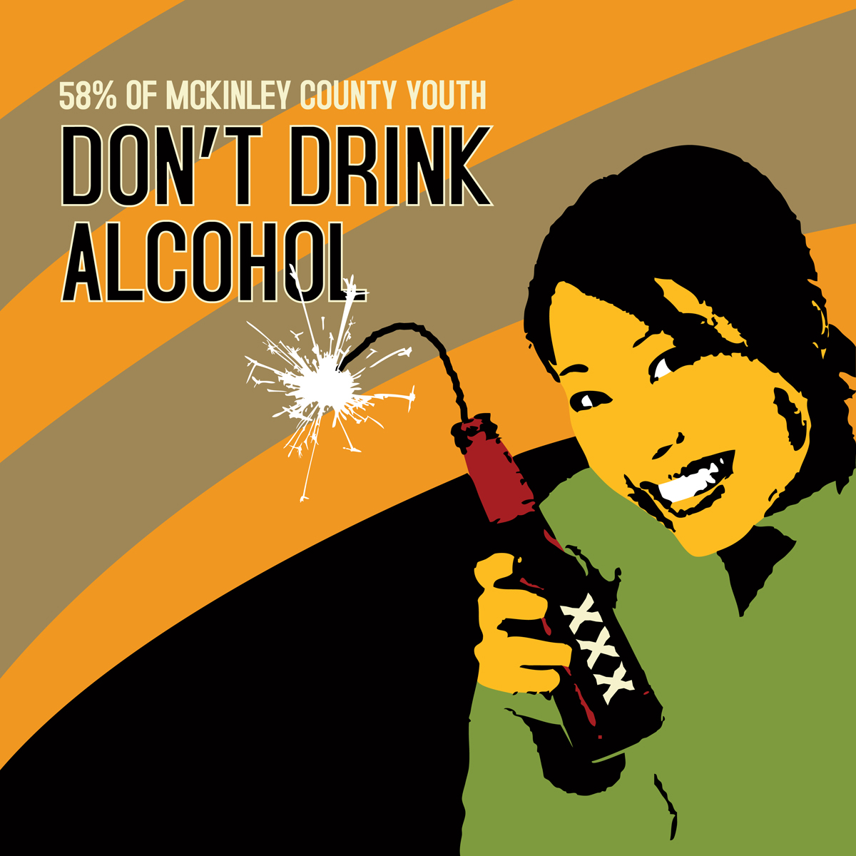
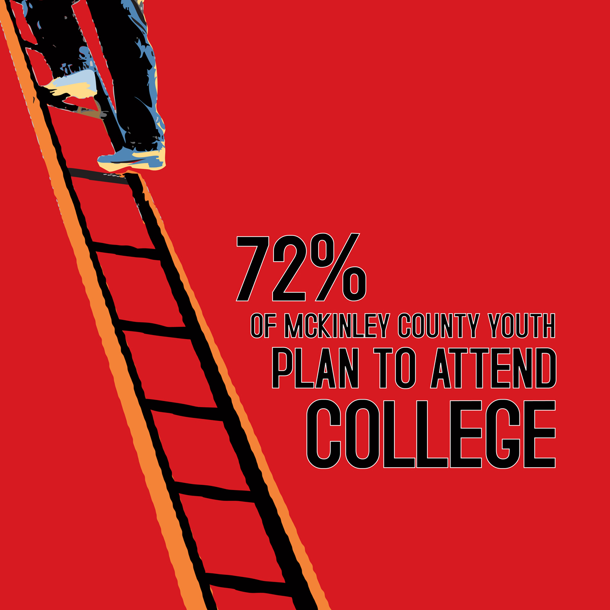
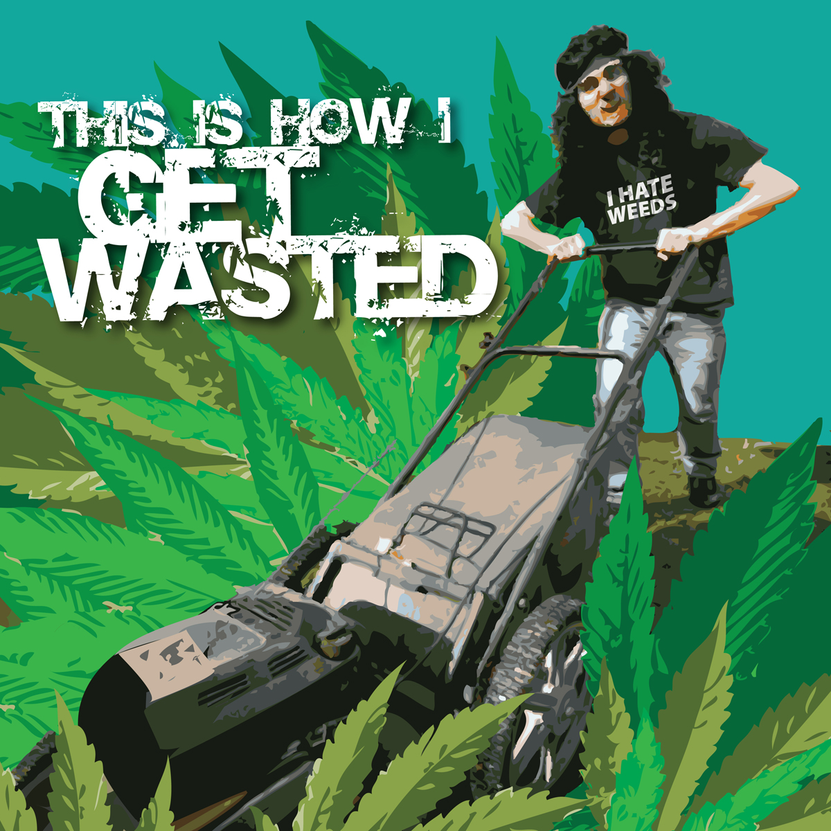
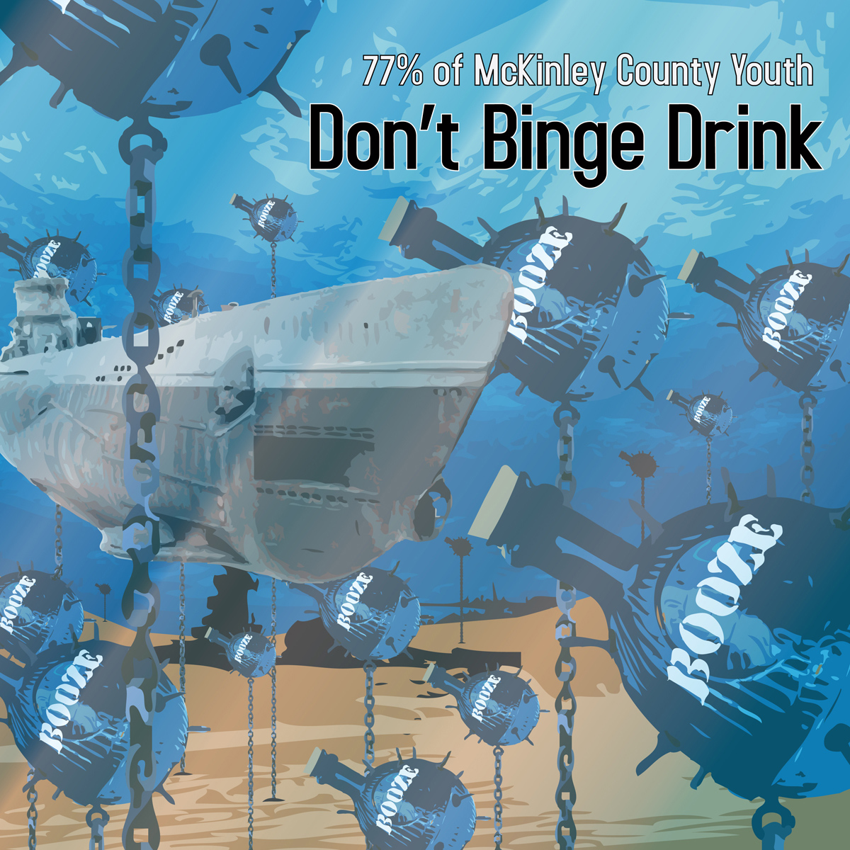
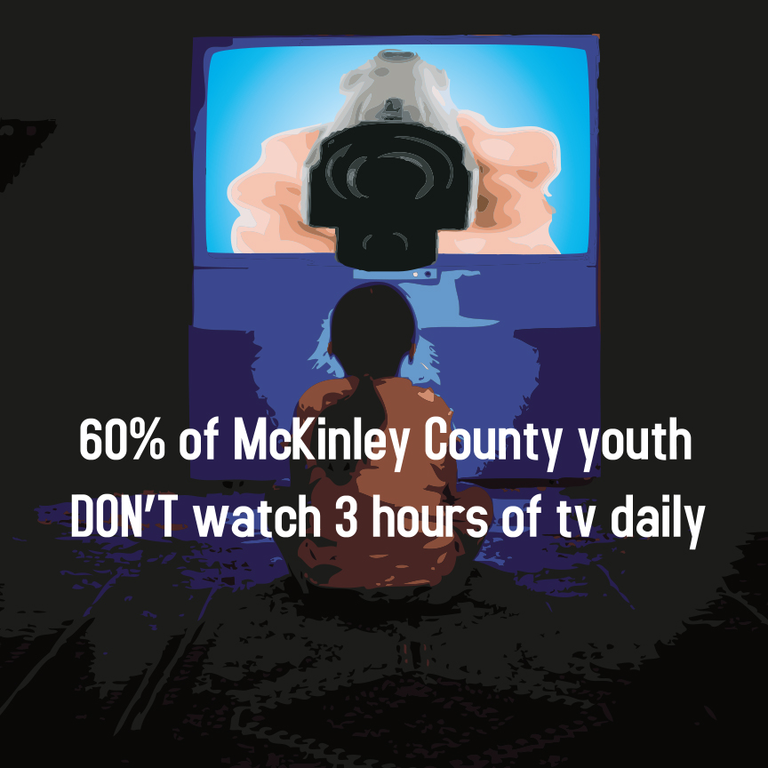
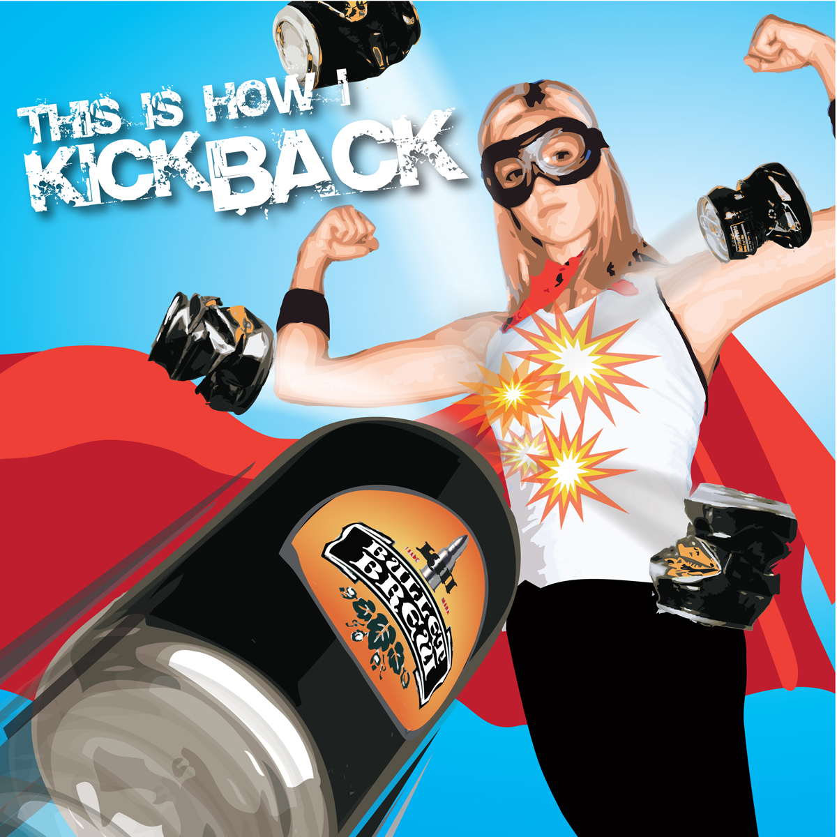
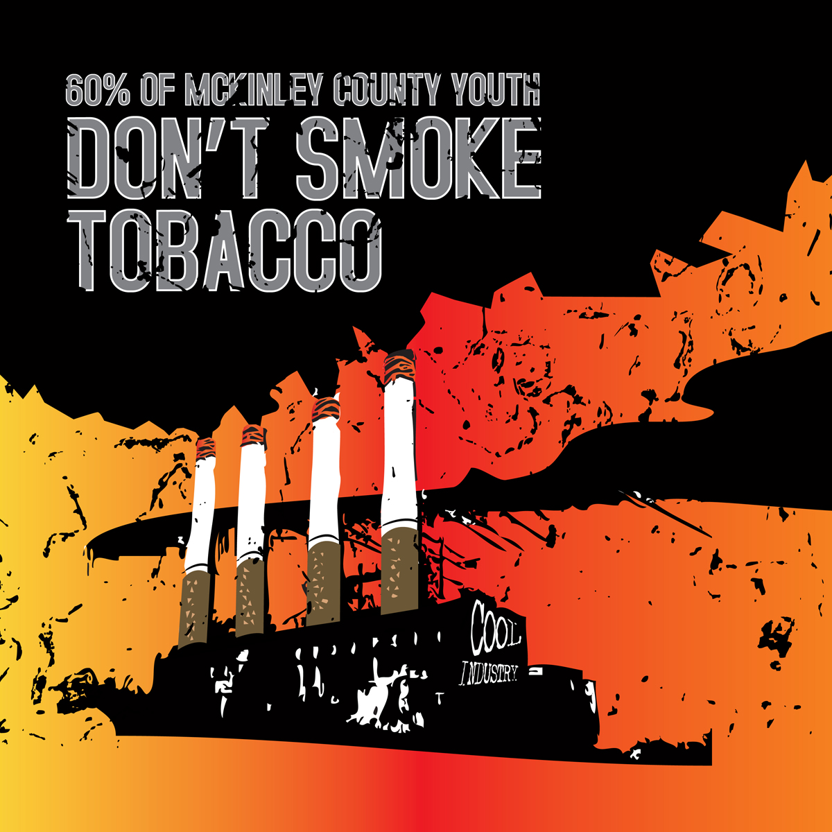
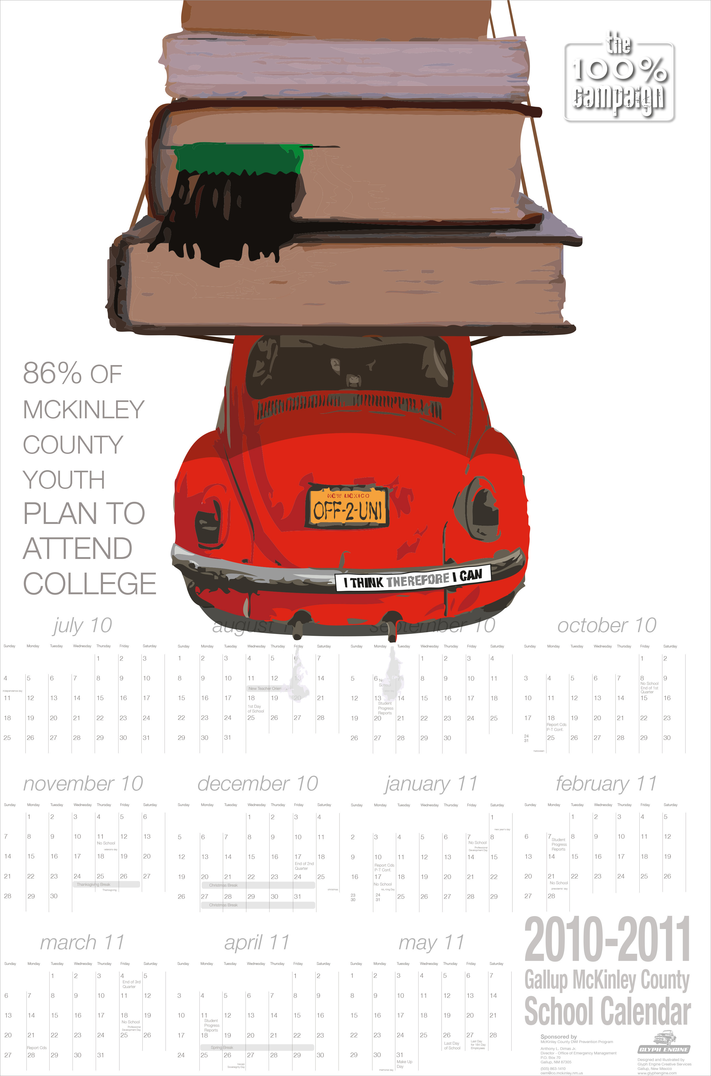
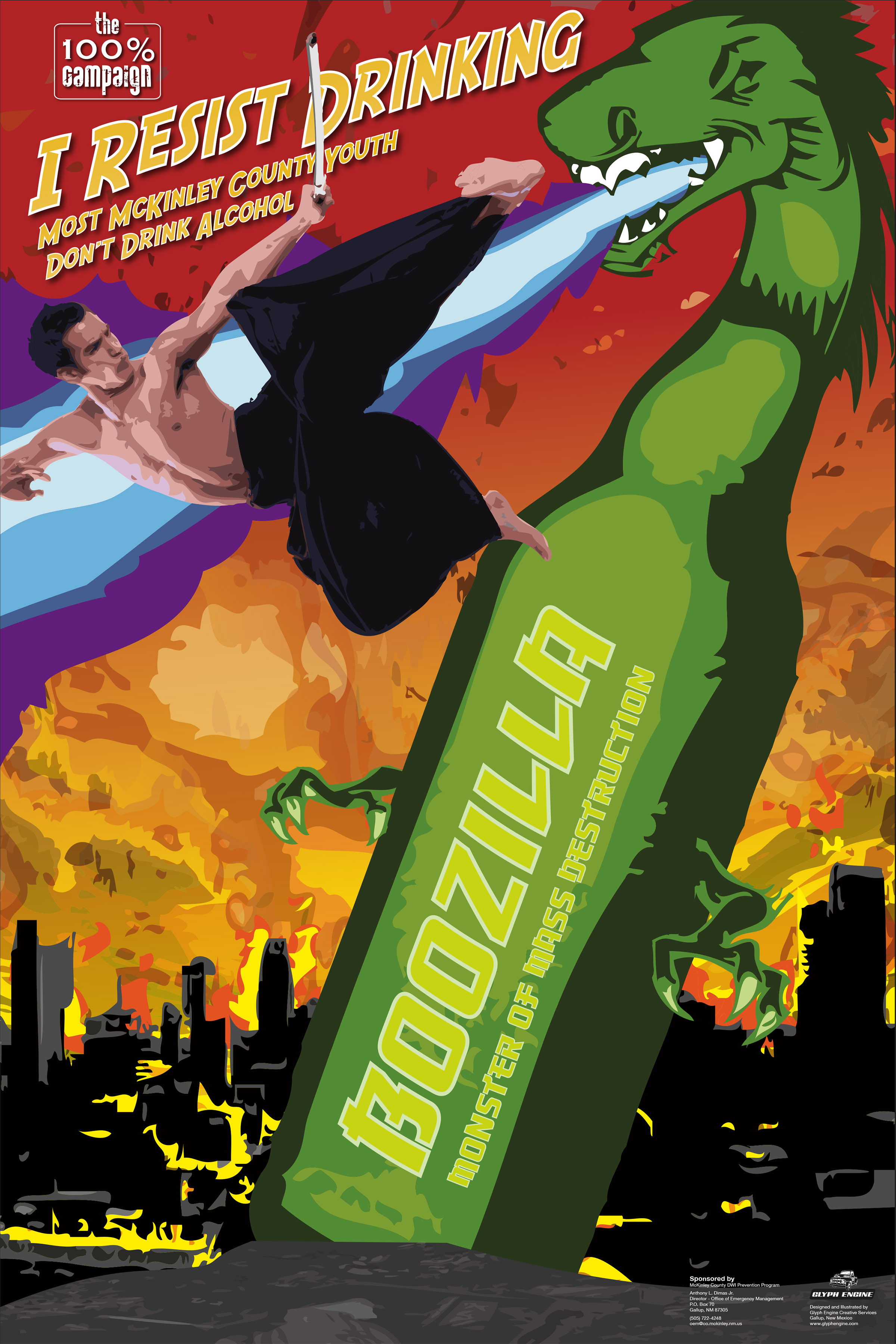
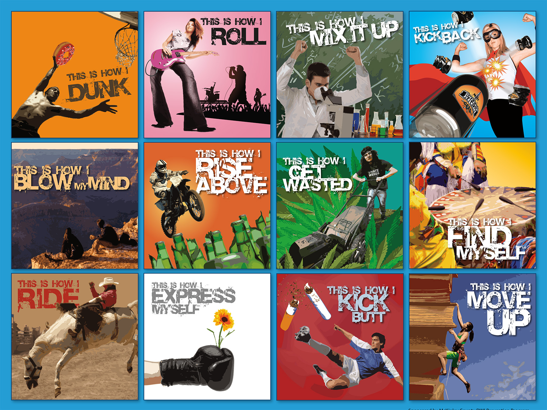
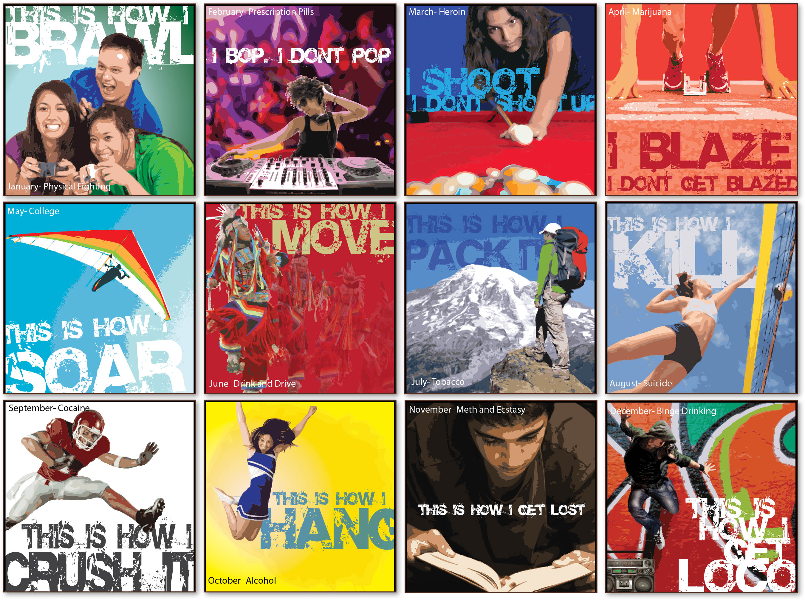
Nobody likes to be singled out as different. Even teens, when they’re honest, don’t like to stray too far from the norm. The concept of the 100% Campaign was to utilize the actual facts of what teens do and don’t do with their free time. Actual studies were done annually and tabulated into a series of facts about how much substance abuse and other negative behavior actually goes on in the region and showed that most young persons do not abuse substances etc. So in a campaign of calendar images, posters, and animated spots, we used a series of facts showing where most people do not partake, encouraging young people that in fact it is normal to not get drunk, smoke weed, do meth etc.
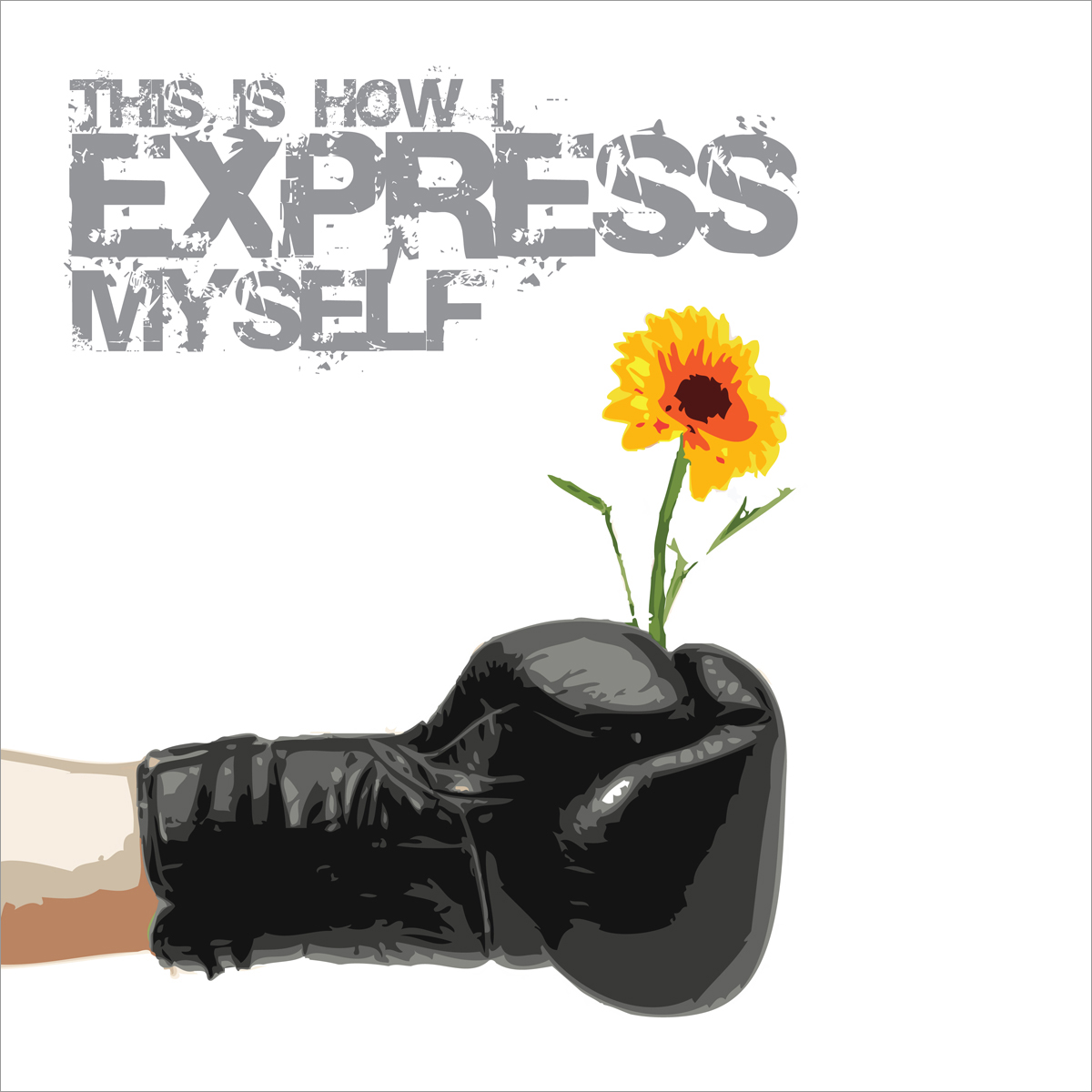
Over multiple years, we employed flash-looking illustrations to memorably portray instances of positive factoids with the general mantra being that almost everyone is not abusing, so let’s make it 100%. This kind of substance abuse messaging has been found to be the most effective in actually changing attitudes toward alcohol and drug consumption. The challenge for us as designers and illustrators was to keep coming up with fresh images for the same list of fact subjects year after year. Even many of the posters we did had some sort of school calendar on them to encourage students and teachers to keep it hung the whole year. We’d like to think that the coolness of the designs kept them up even after the year was done.
12″ x 24″ wall calendar Series and 36″ x 48″ Posters for multiple consecutive years
Client
McKinley County
Category
Design, Illustration
Click through Images

